Designing a reusable editorial publication
The main challenge was to create a magazine that was both aesthetic, structured, and functional, and that could be adapted for each new program.
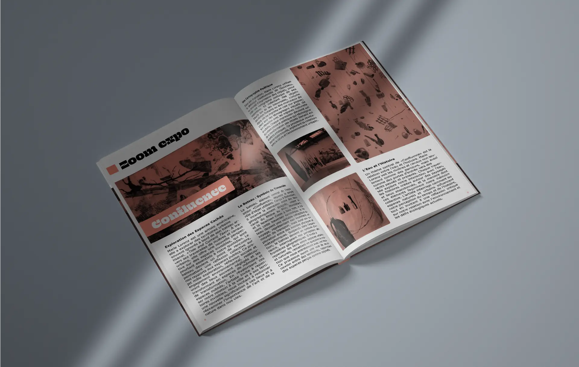
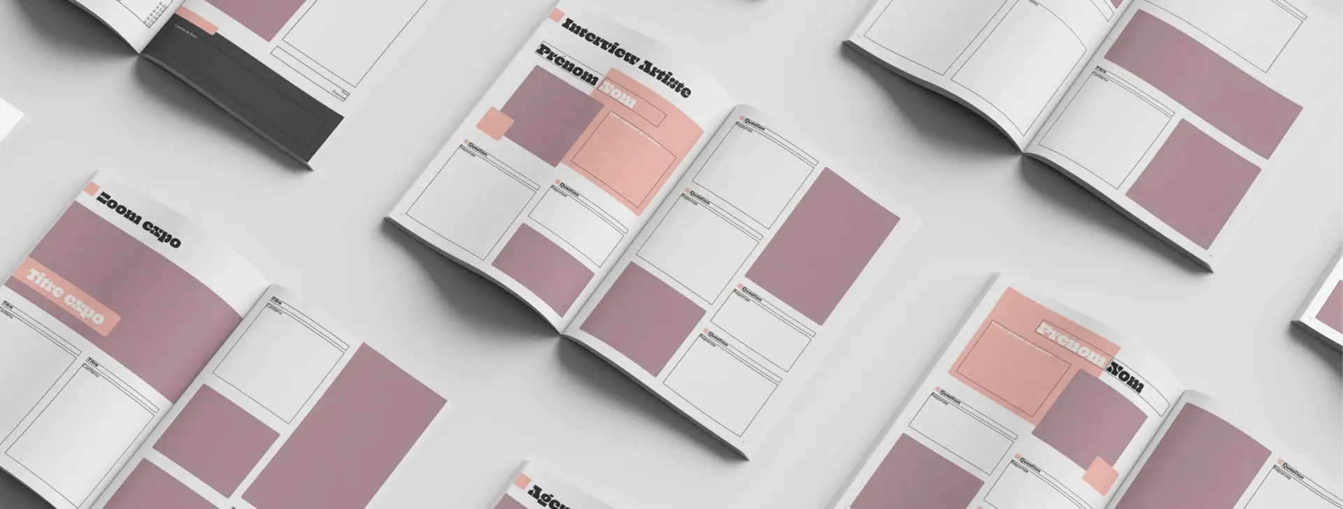
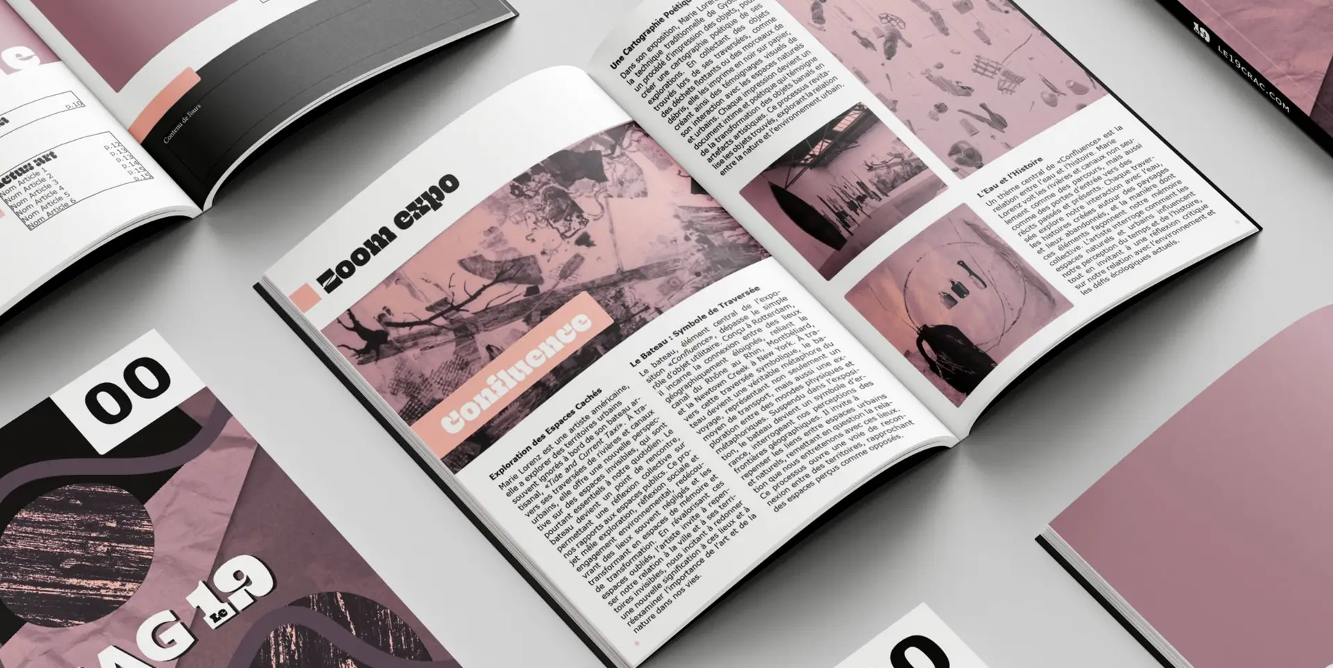
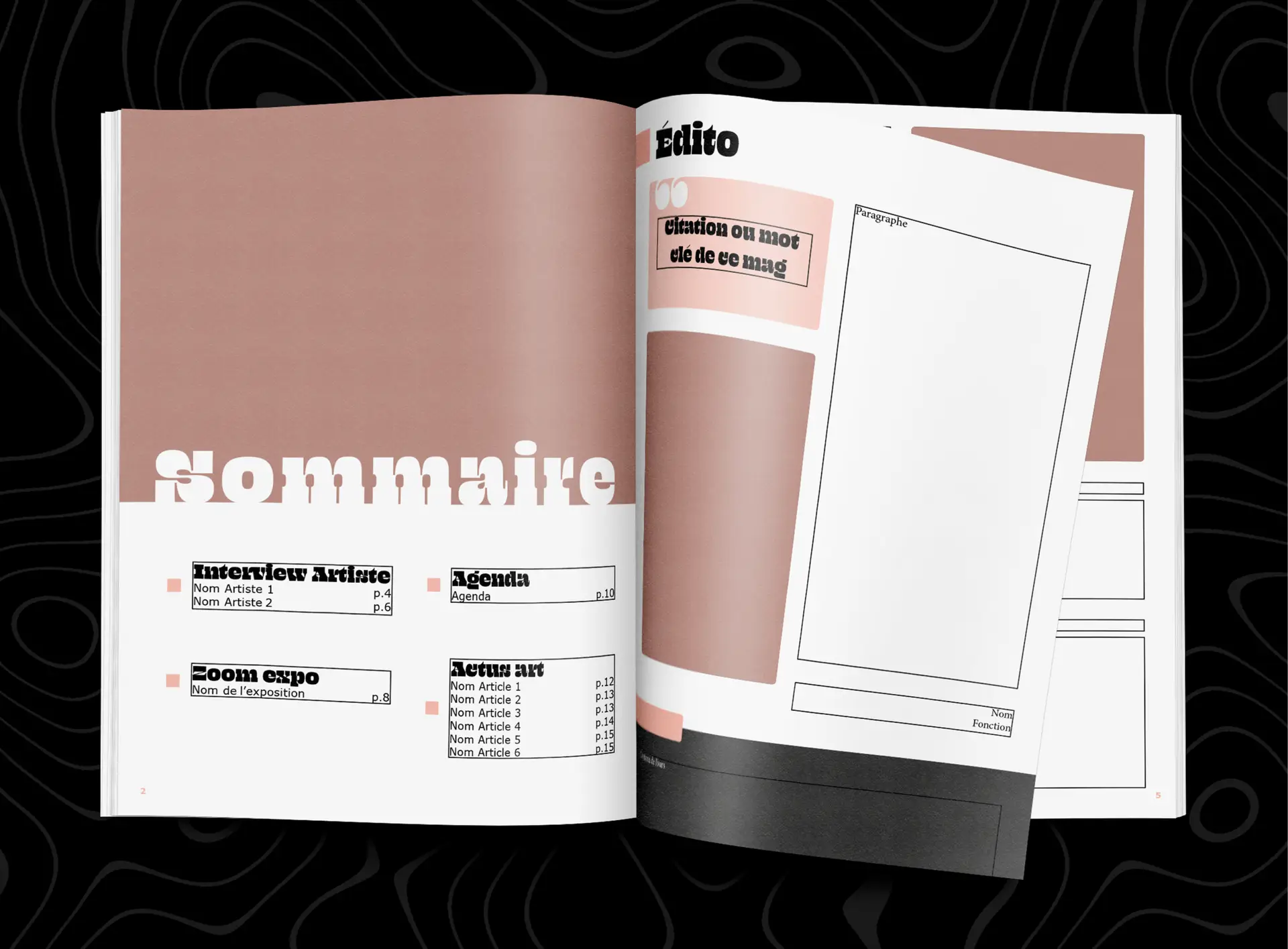
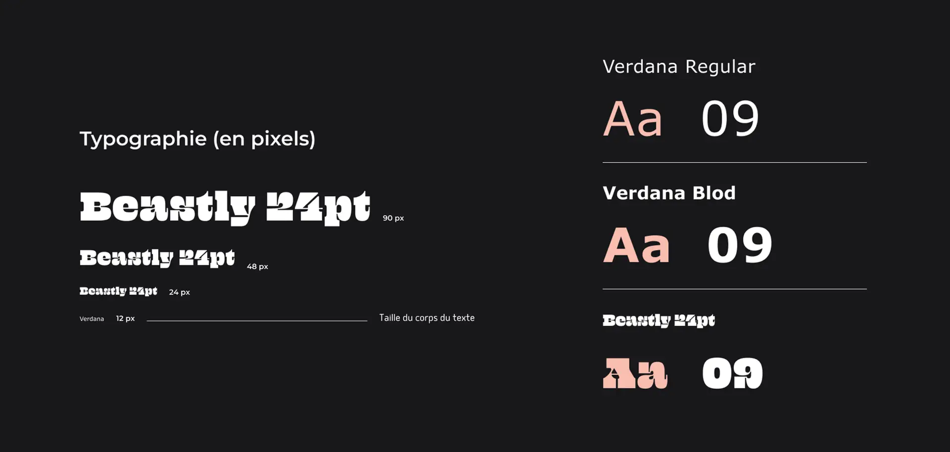
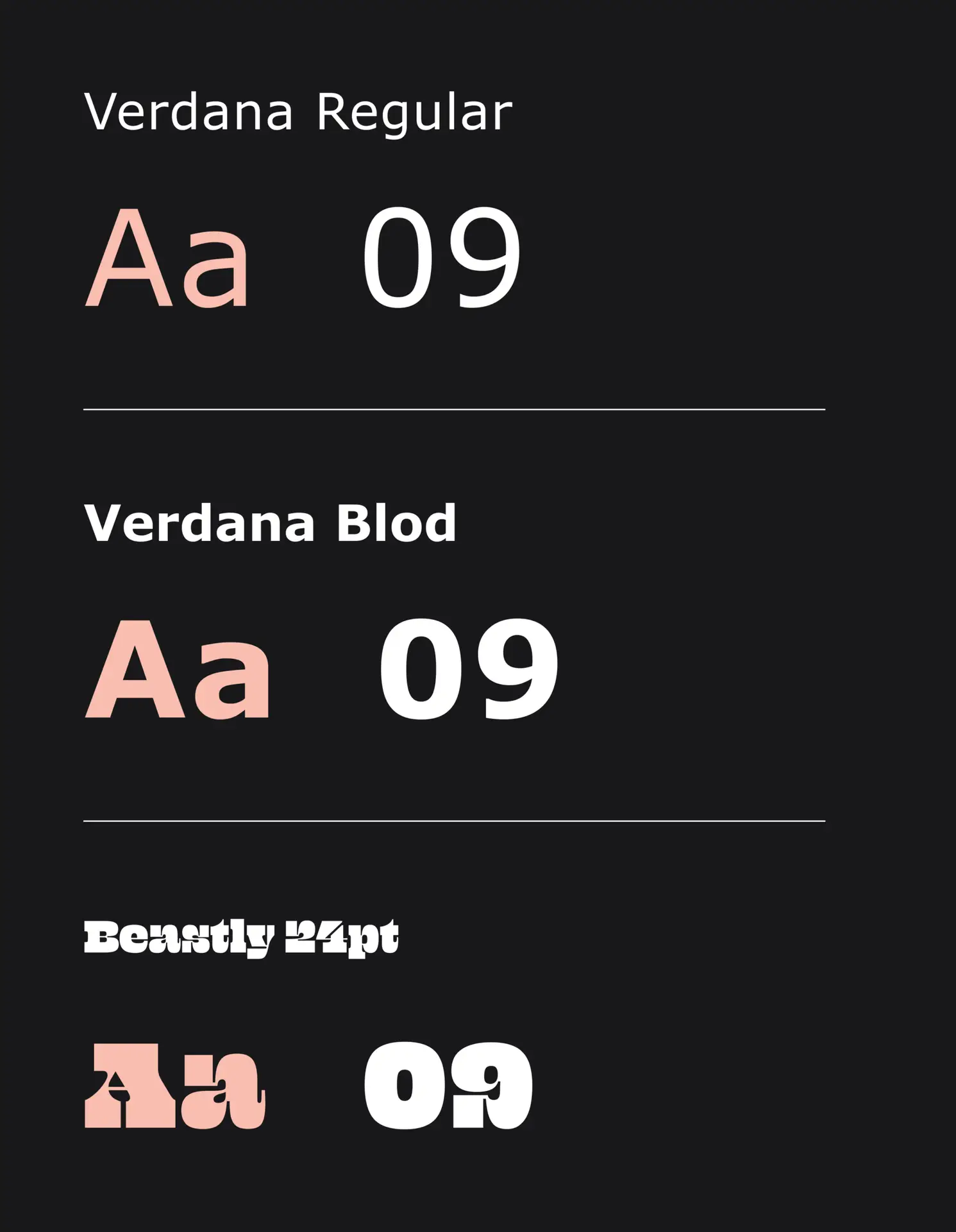
I designed a complete template in InDesign, including the definition of an editorial line, the creation of the flatplan, and the organization of the sections.
The entire layout was conceived to facilitate the quarterly updating of the publication by the CRAC team, while maintaining strong graphic consistency from one edition to the next.
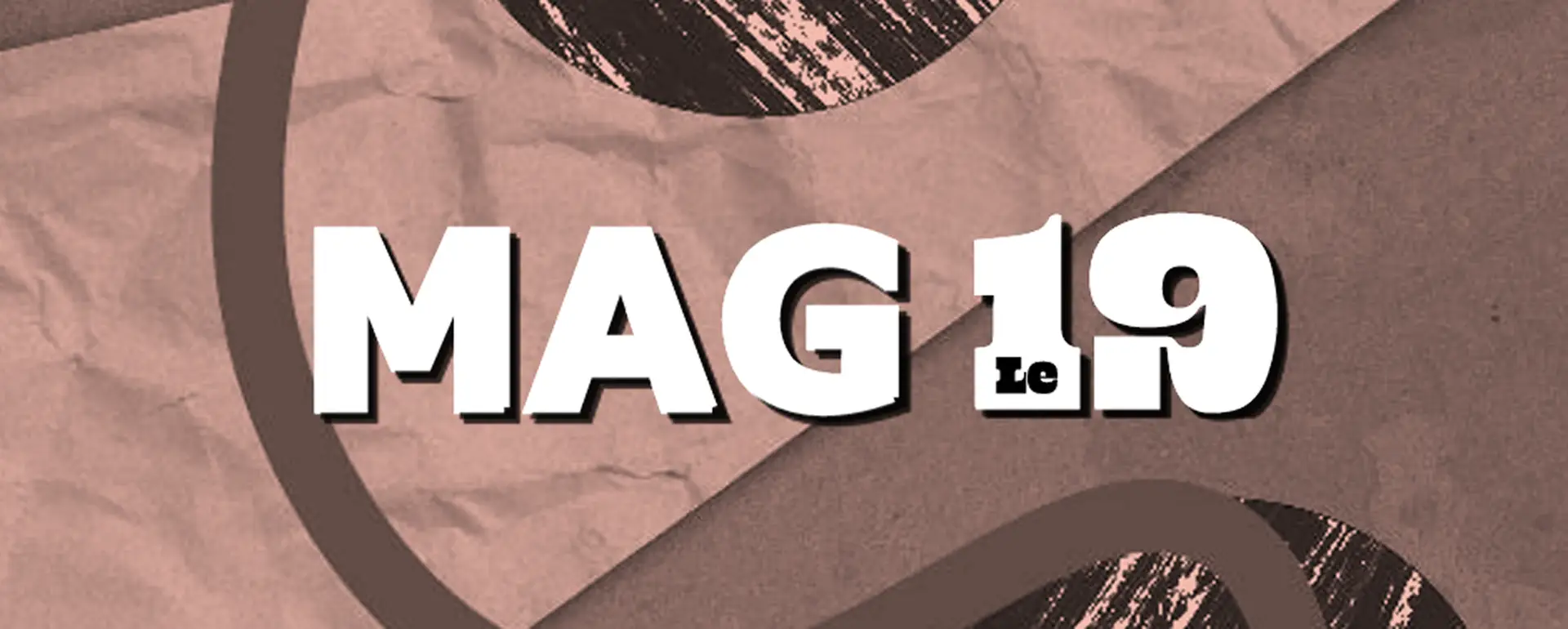
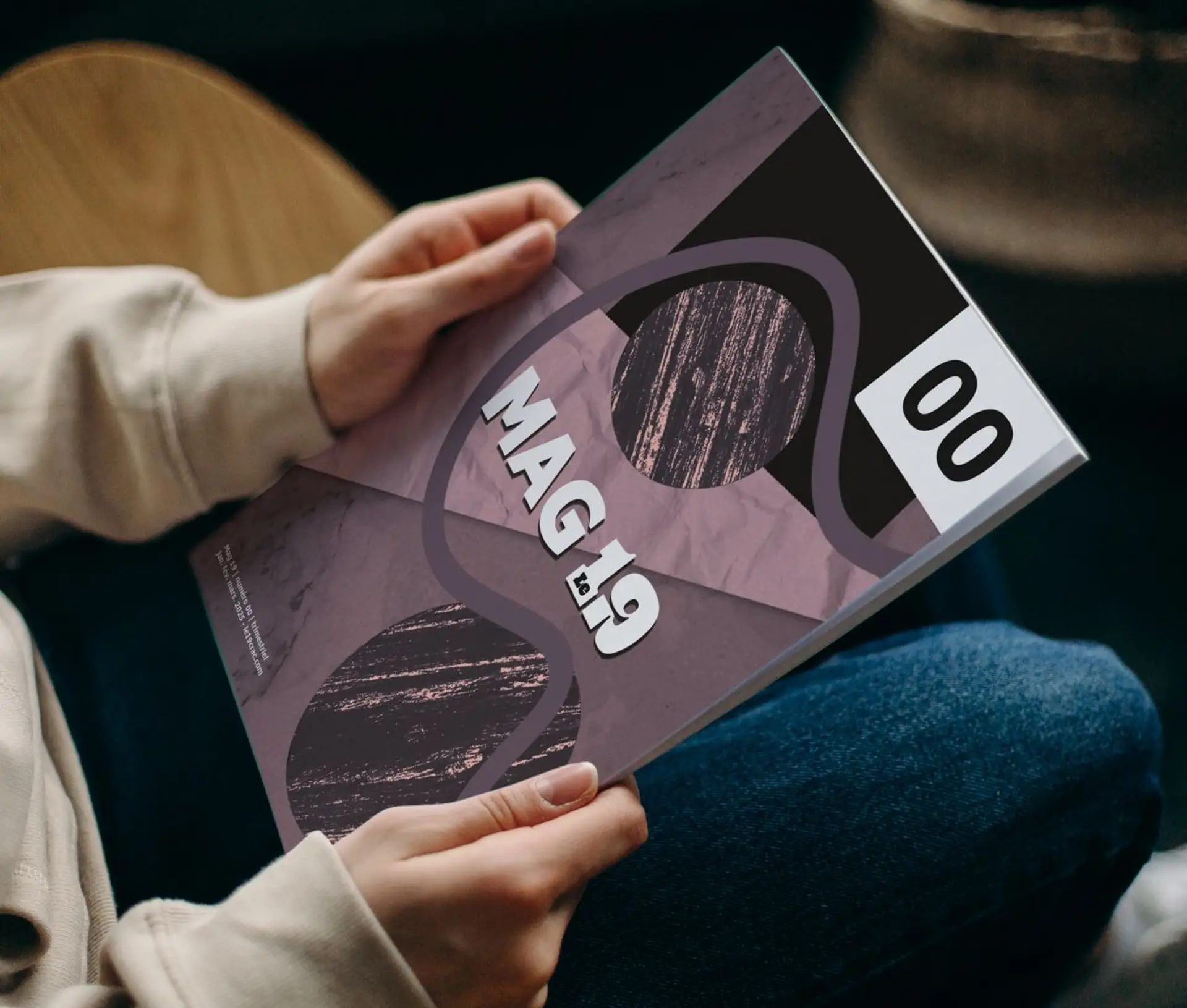
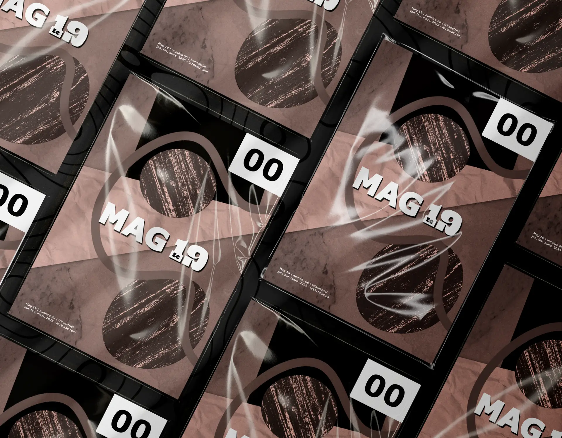
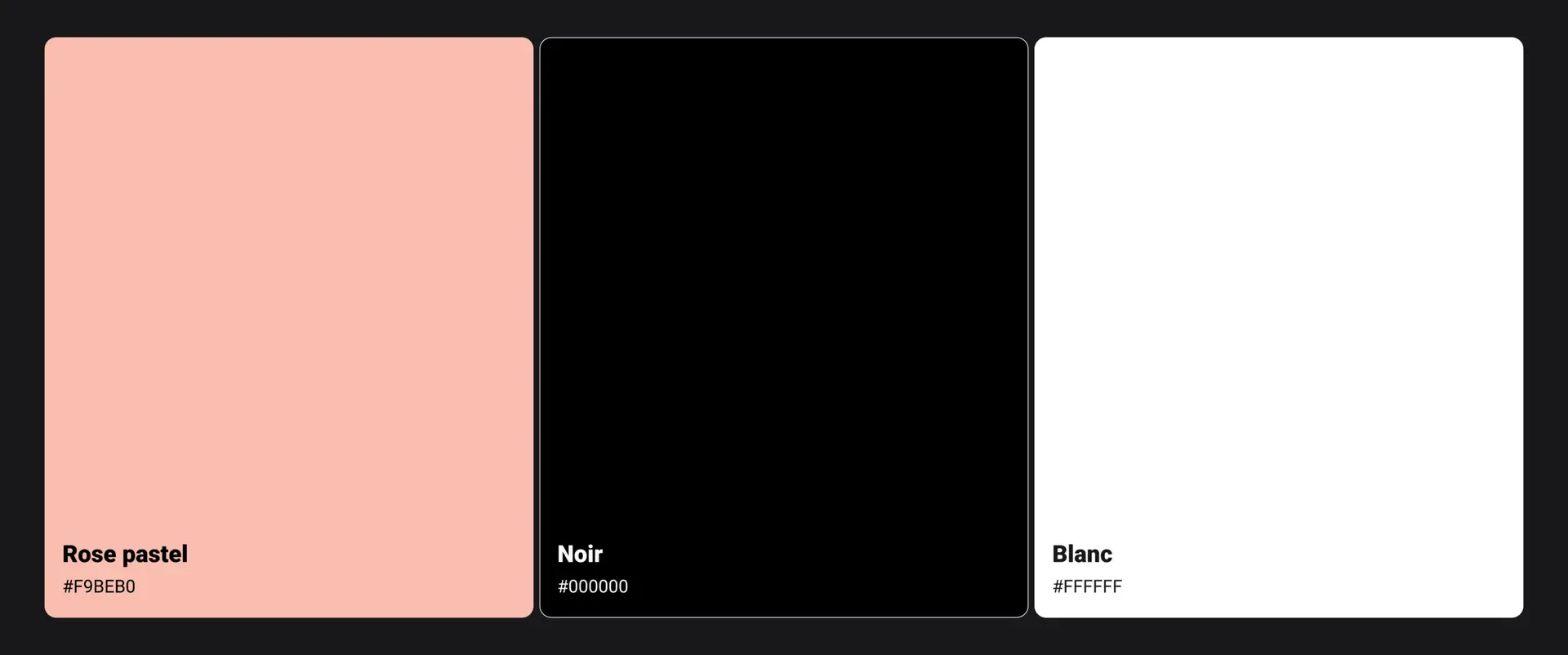
The graphic identity is based on a bichromatic approach, reusing the existing colors from the CRAC website, notably its signature pink. This choice ensures continuity between digital and print media.
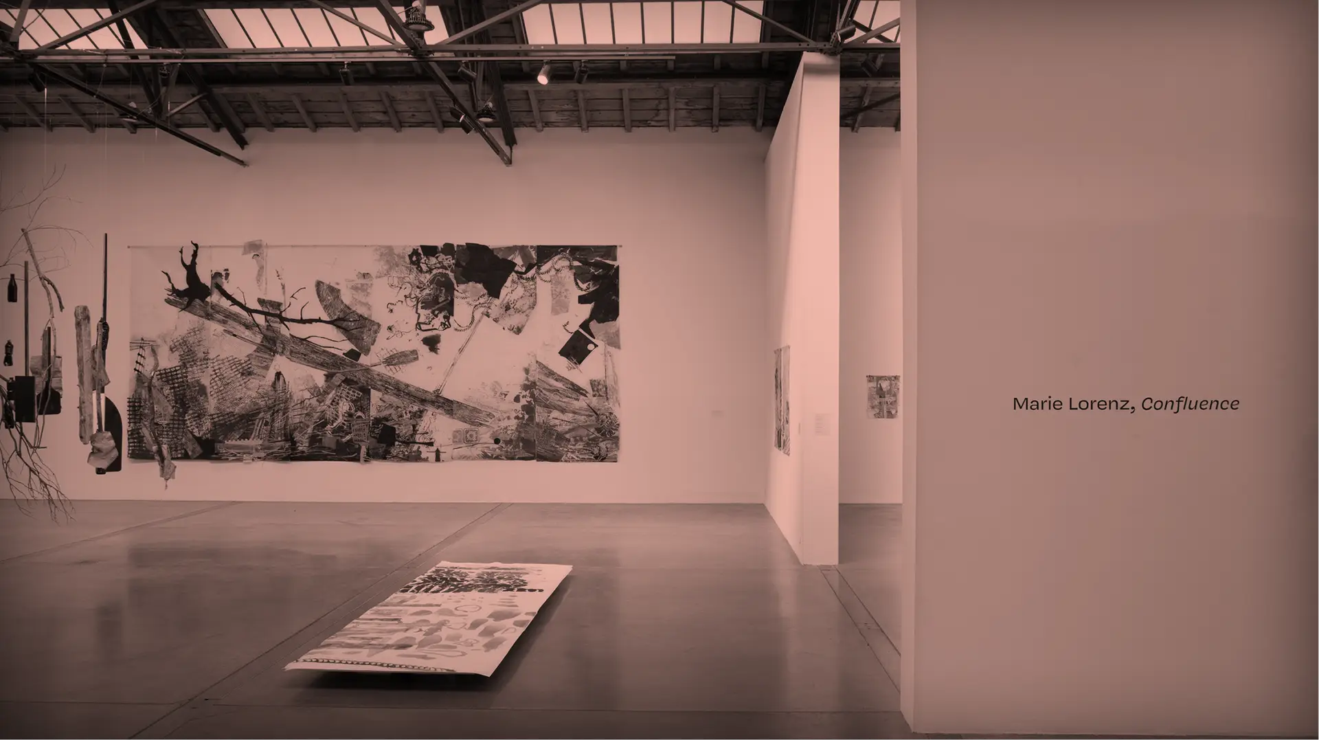
The cover draws inspiration from the visual codes of a work by Marie Lorenz presented in the Confluence exhibition. The artwork was digitally reinterpreted to create a strong visual hook that remains consistent with the artistic universe of the center.
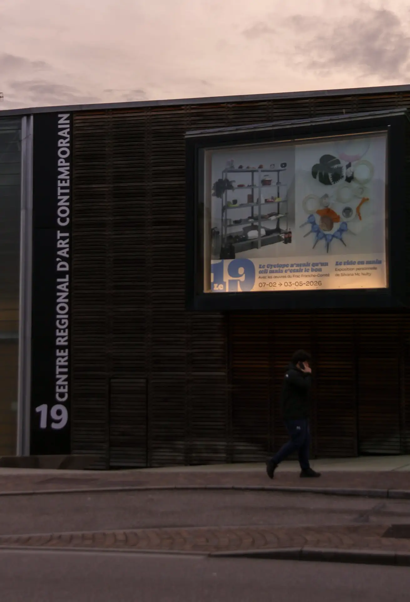
The overall design aims to reflect the contemporary positioning of the venue while asserting a clear and recognizable artistic direction.