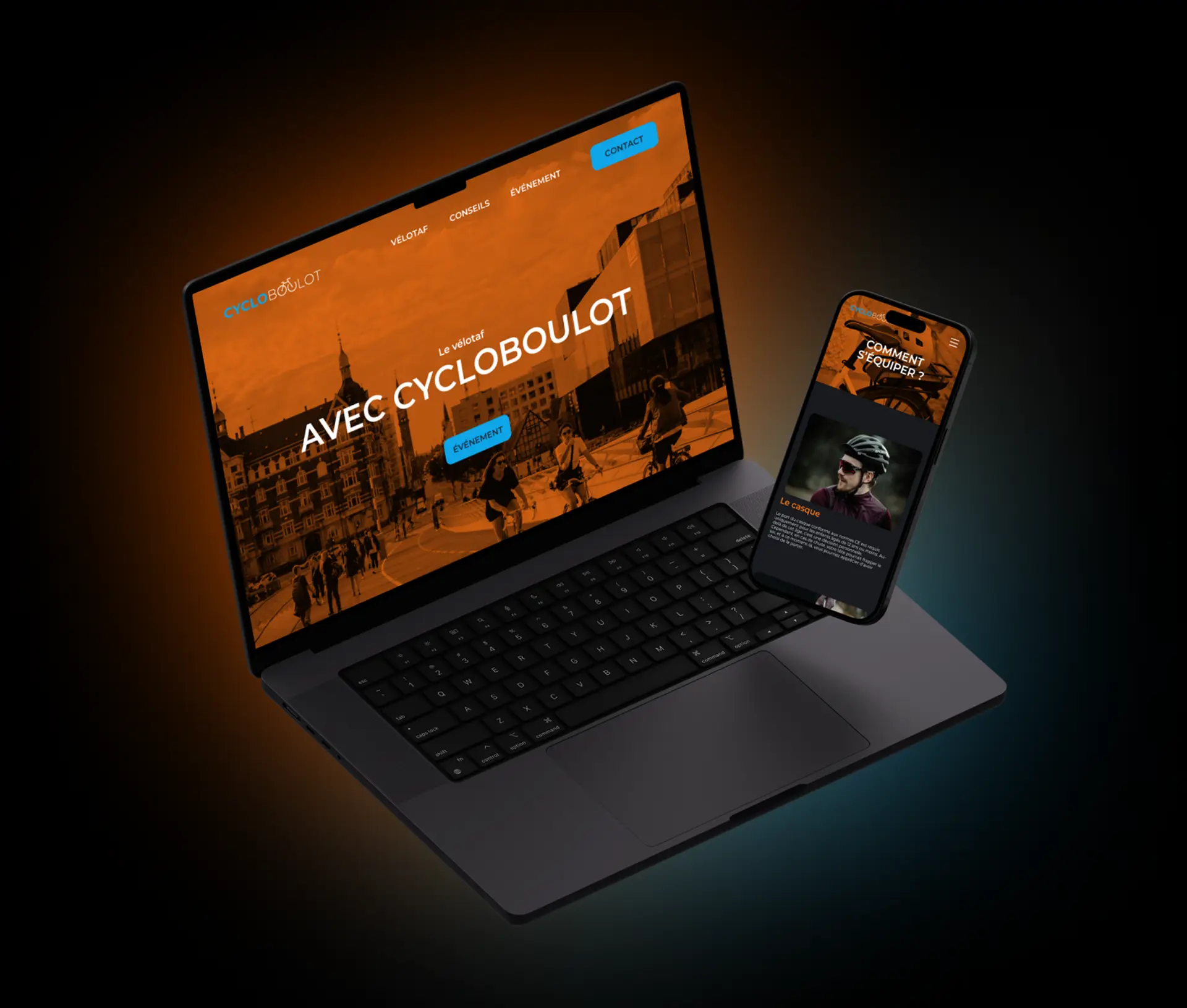
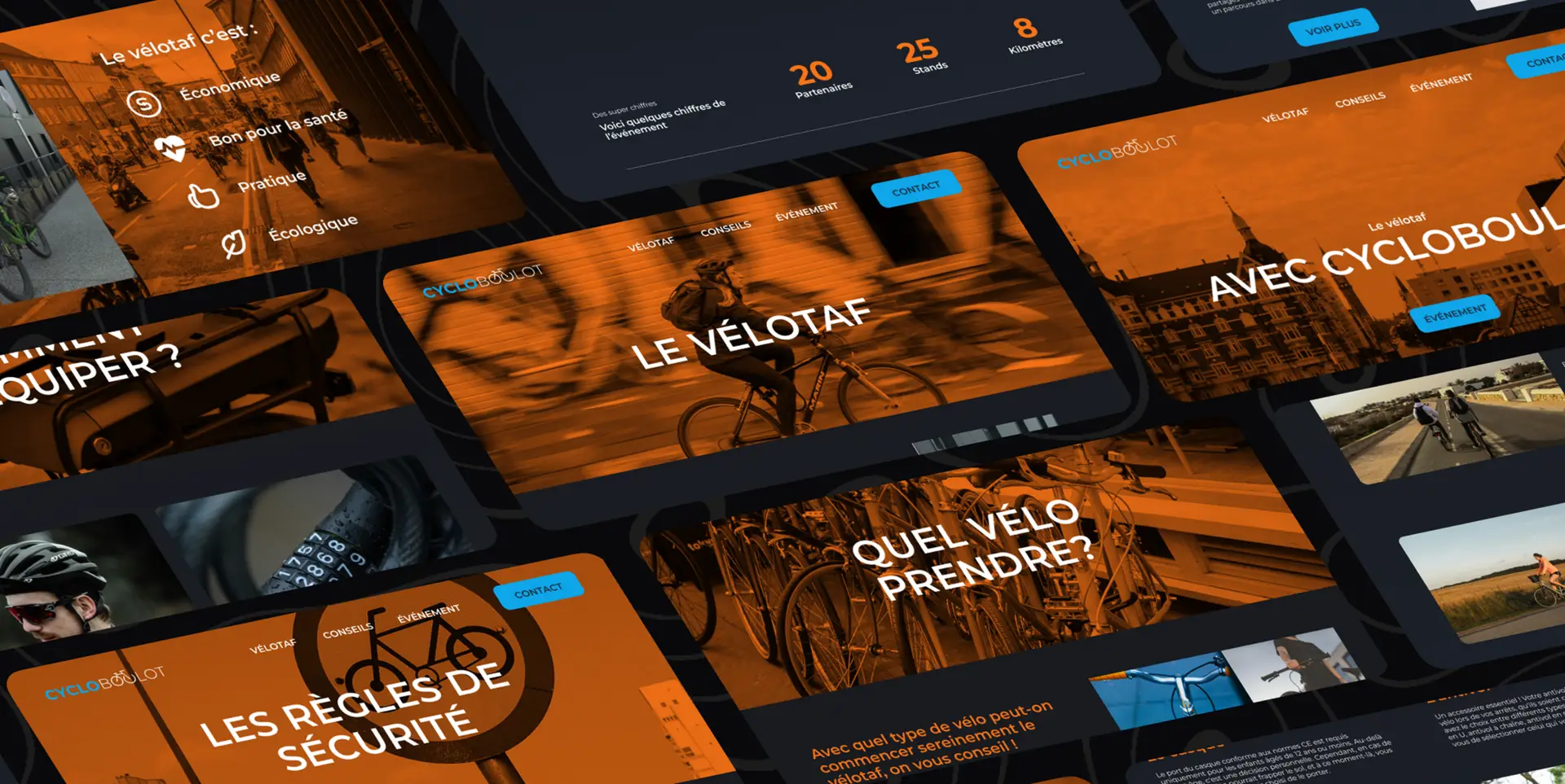
Encouraging cycling to work through a communication campaign
CycloBoulot aims to highlight the benefits of cycling to work, an ecological and economic mode of transport. By offering practical information, advice, and safety tips for commuting by bike. The project was also designed to promote local initiatives and actions implemented by local authorities to encourage cycling.
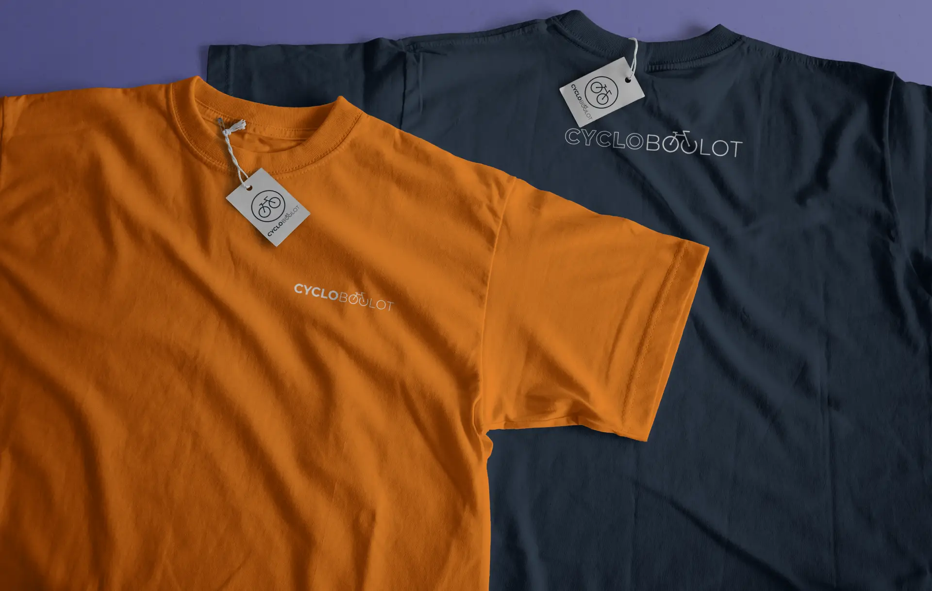
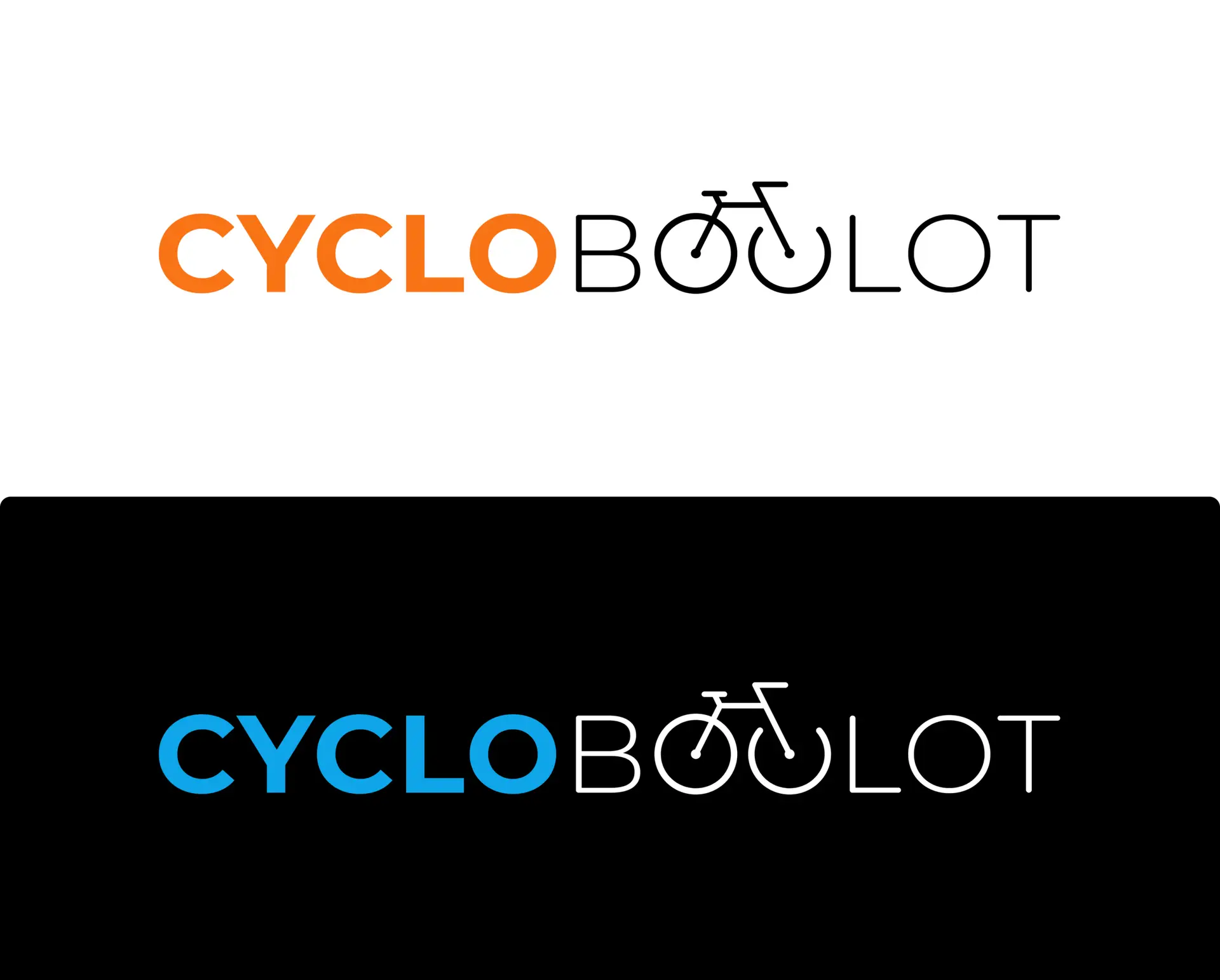
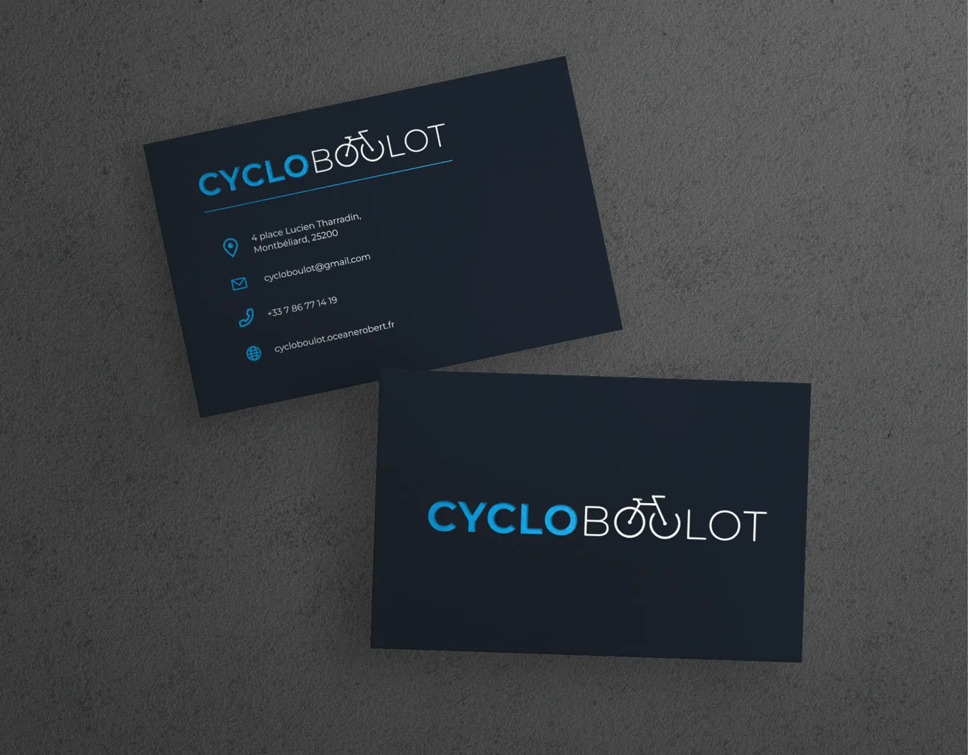
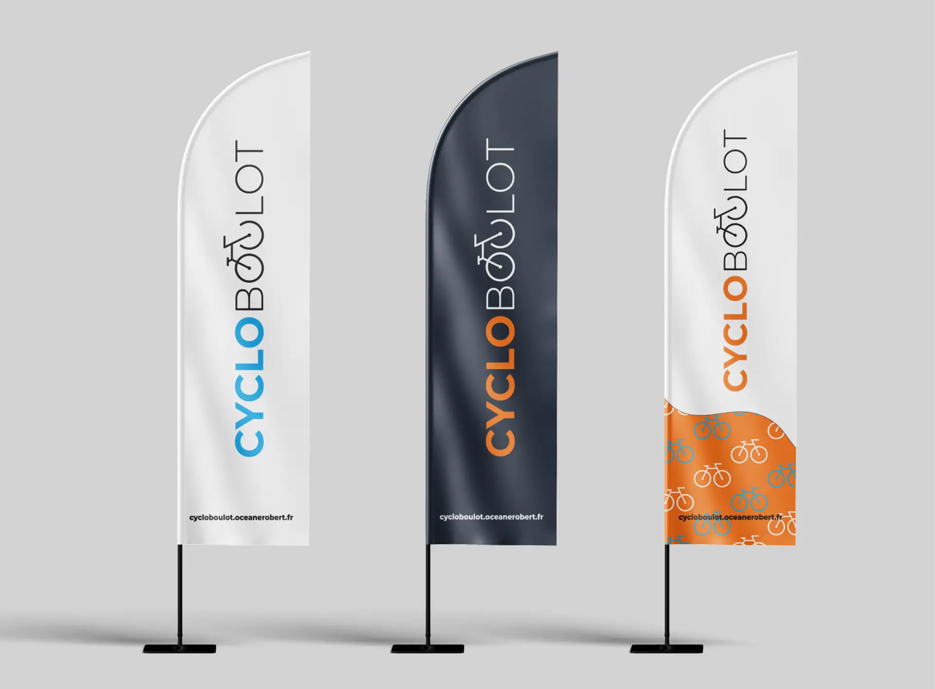
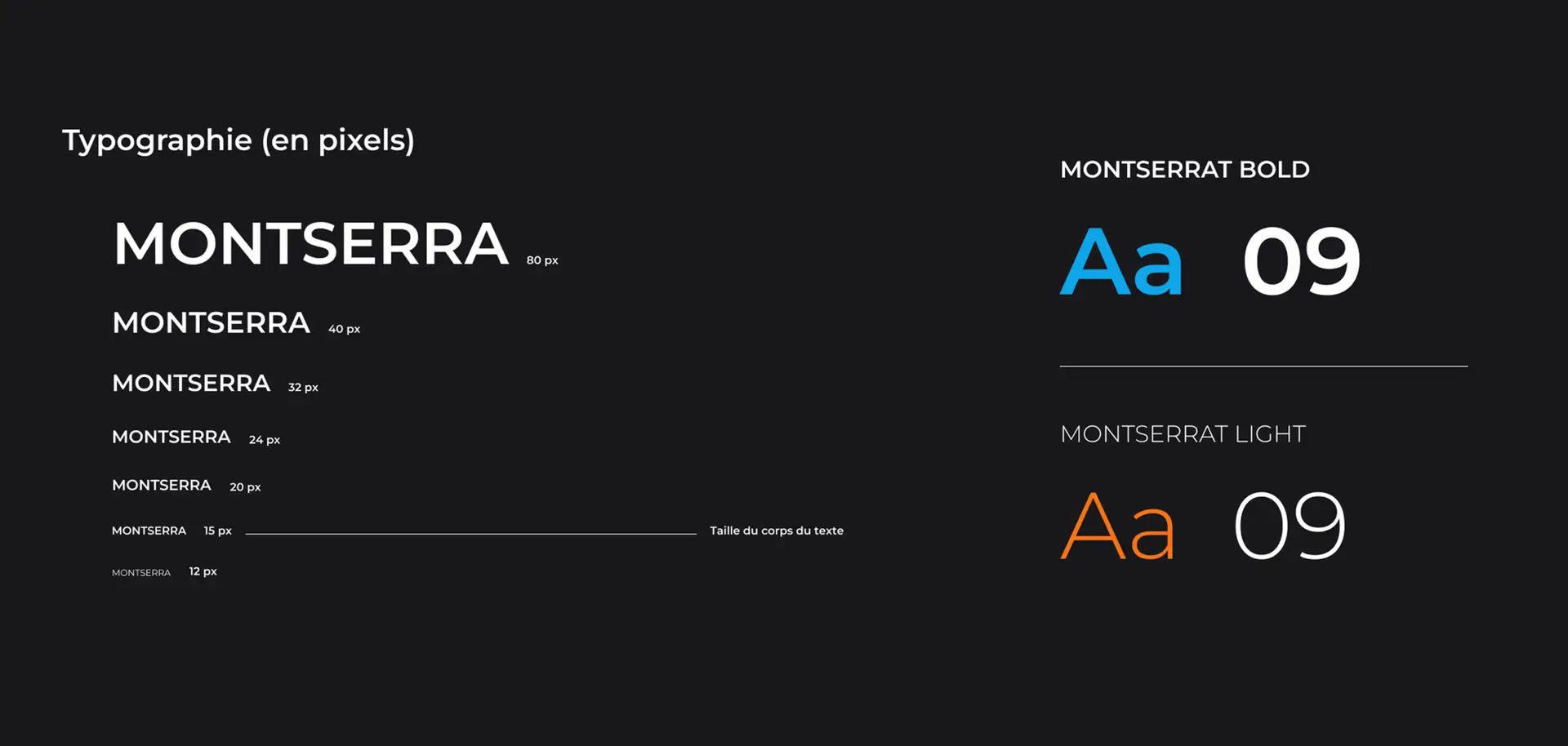
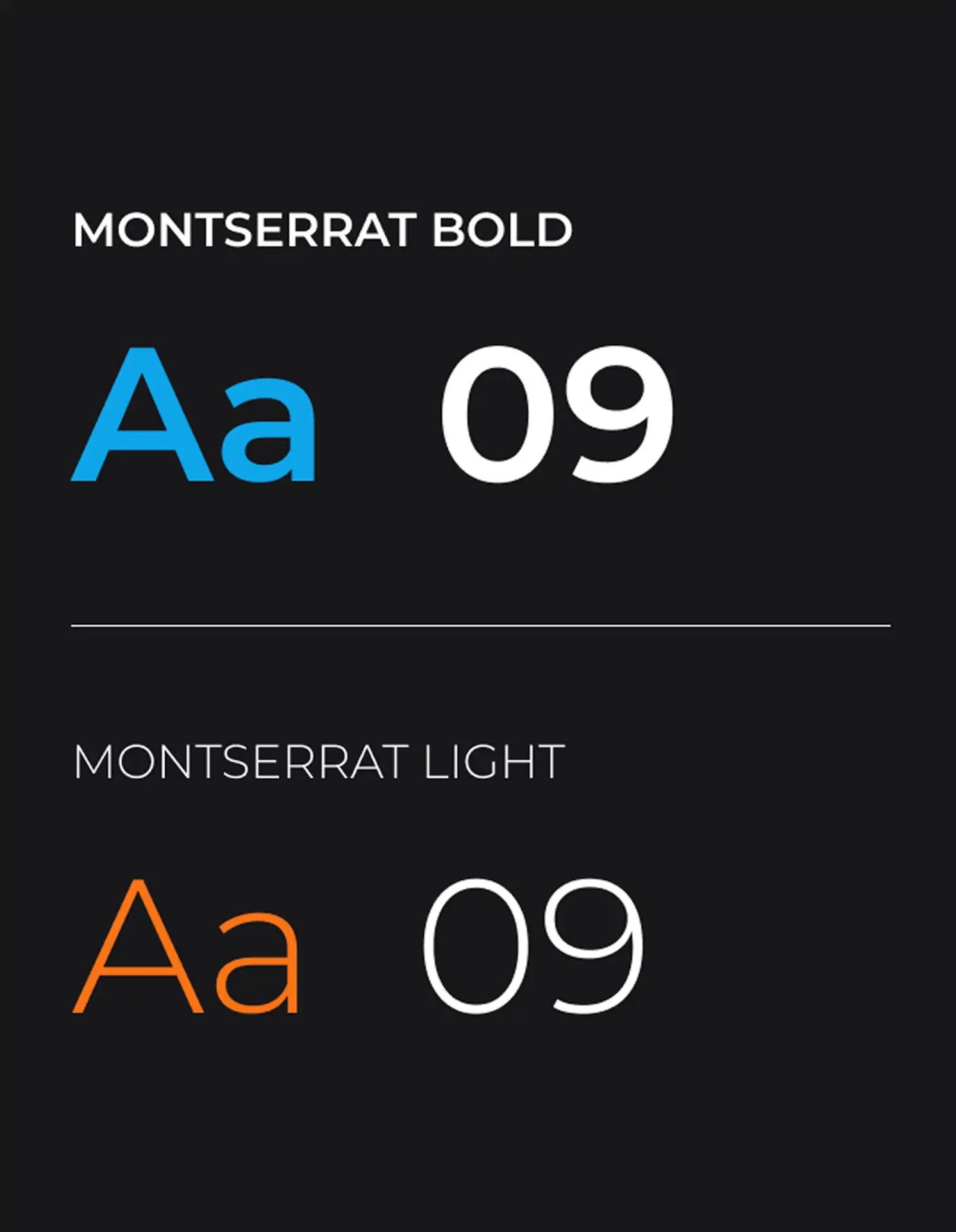
Our logo represents the combination of cycling and work. The name of the brand is written in two parts. The first part is bold with straight outlines to convey seriousness in the workplace. The second part is softer and more rounded, giving an impression of lightness.
We integrated a bicycle into the letters "OU" of the word "boulot" to signify commuting to work by bike.
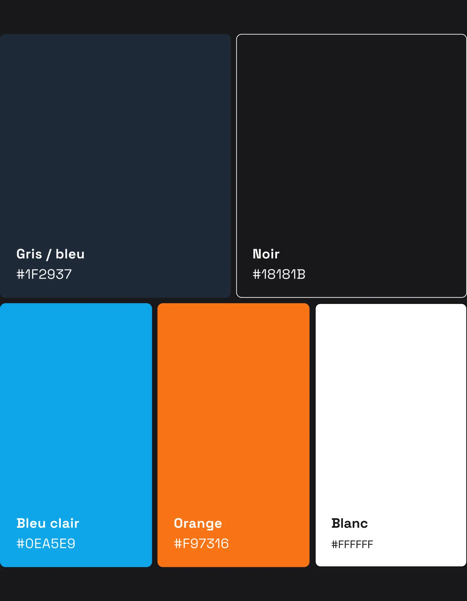
Regarding colors, blue represents the sky and conveys a sense of freedom, while orange represents professional work and the speed of cycling as a means of transport.