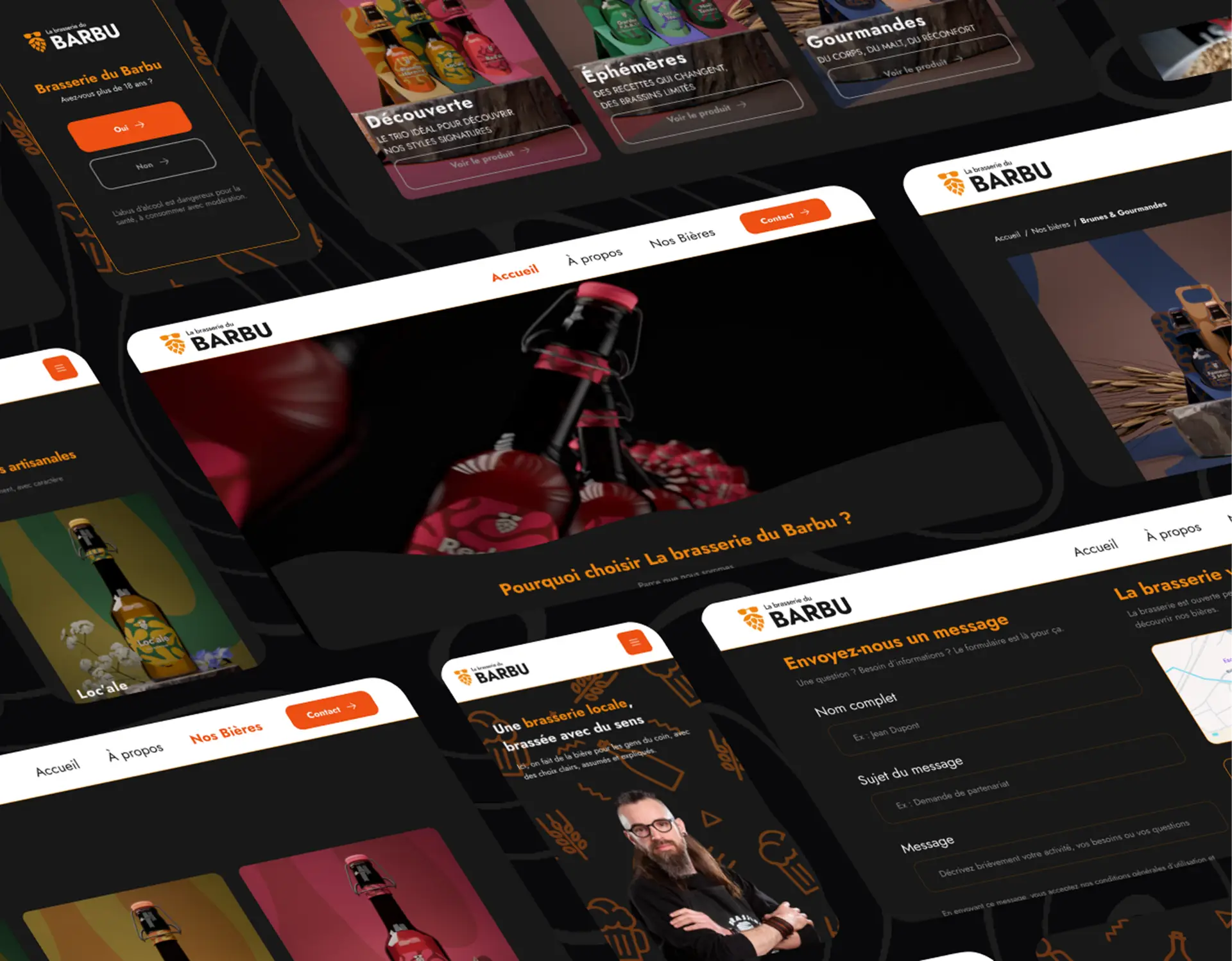
STRUCTURING THE POSITIONING AND STRENGTHENING BRAND IMAGE
The goal was to clarify the positioning of the brewery, establish clear and coherent foundations, and build a strong brand identity.
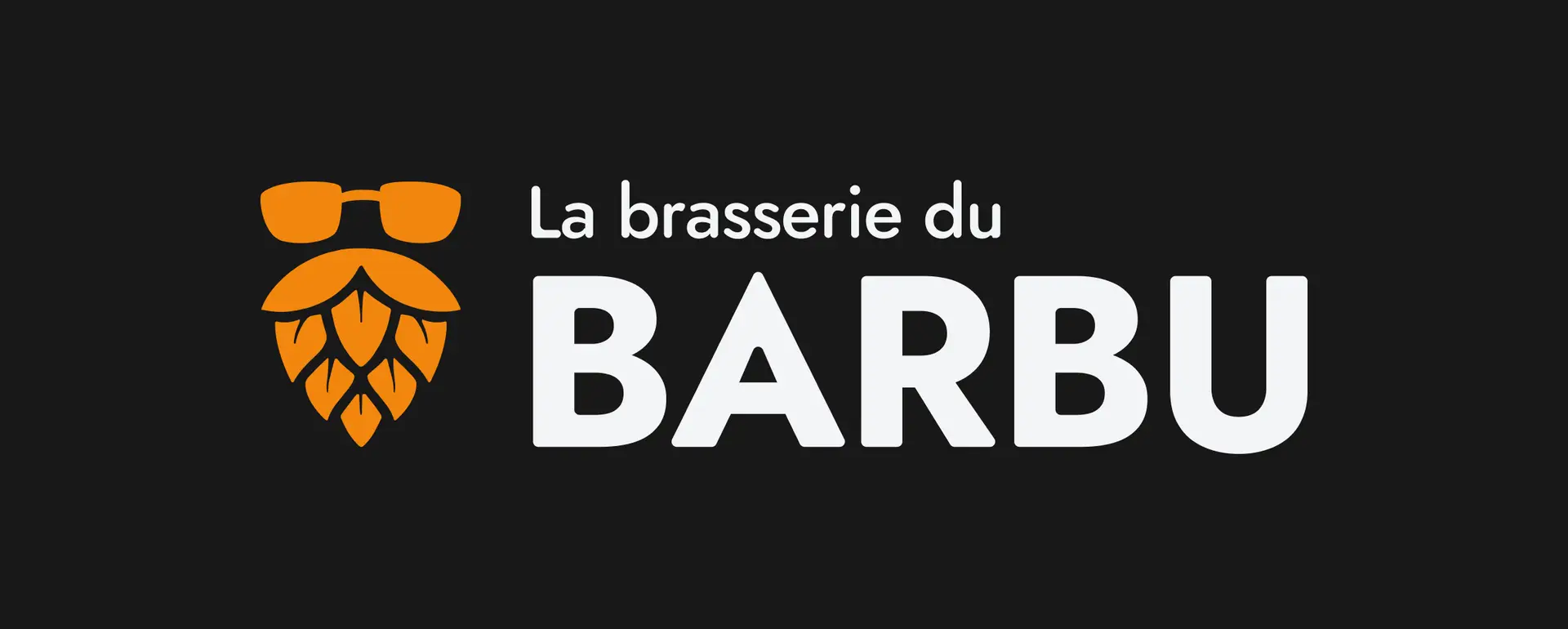
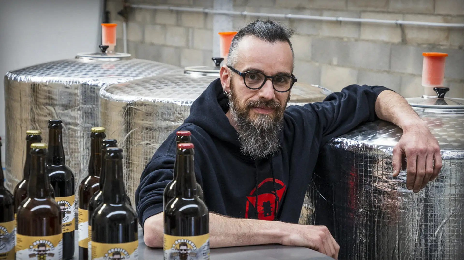
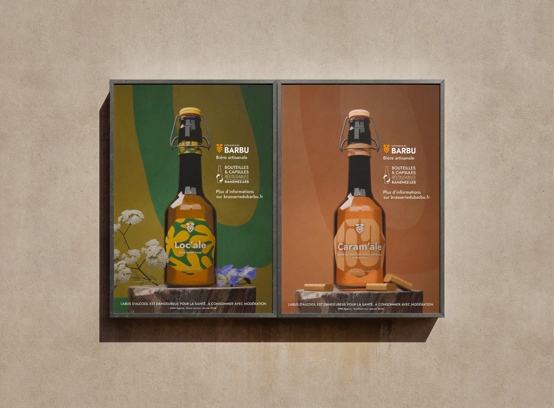
The project aimed to reposition its visibility: enhancing its commitments (local sourcing, controlled fermentation, environmental responsibility) and professionalizing its image by integrating the existing logo, notably the famous beer moustaches.
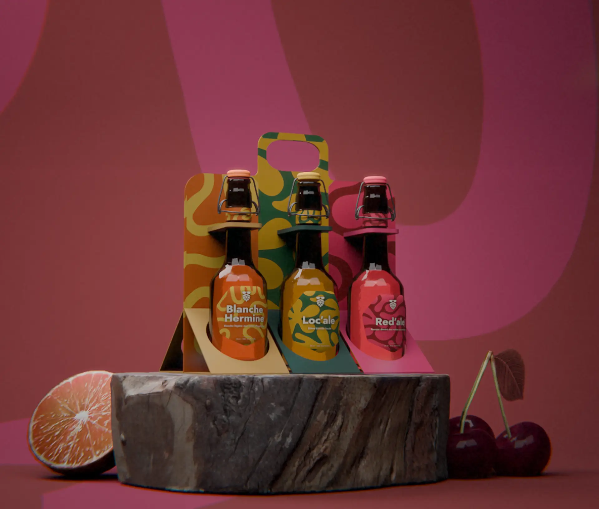
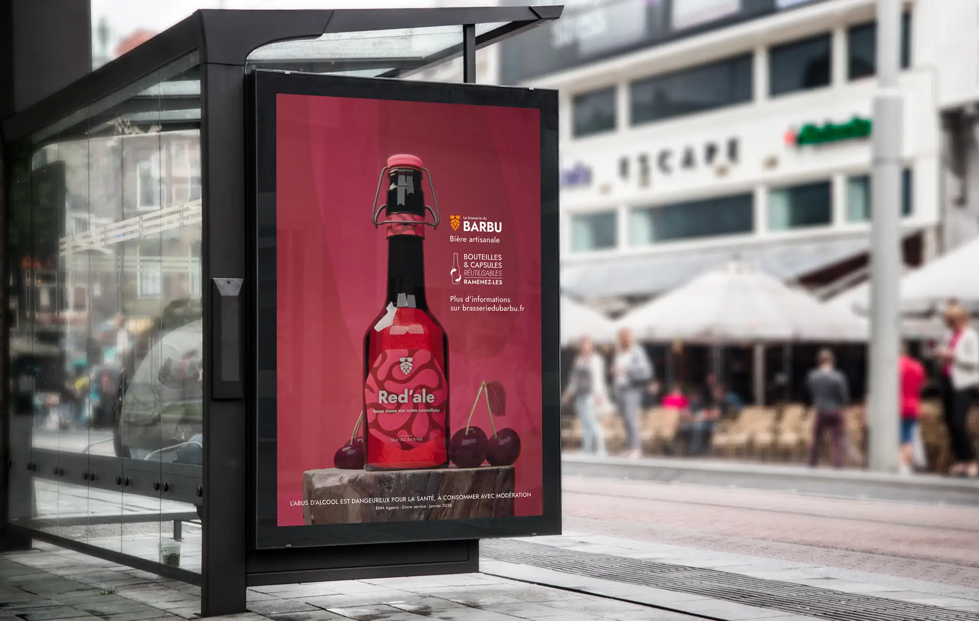
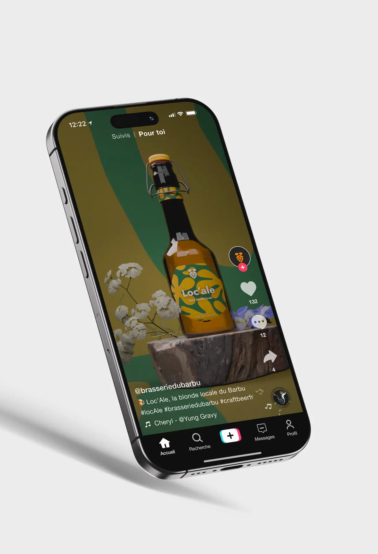
The whole project was conceived as a multichannel strategy integrating web, social media, print, and 3D assets.
The artistic direction is based on a global 3D coherence, with all print materials designed in 3D to ensure visual continuity with the elements integrated into the website.
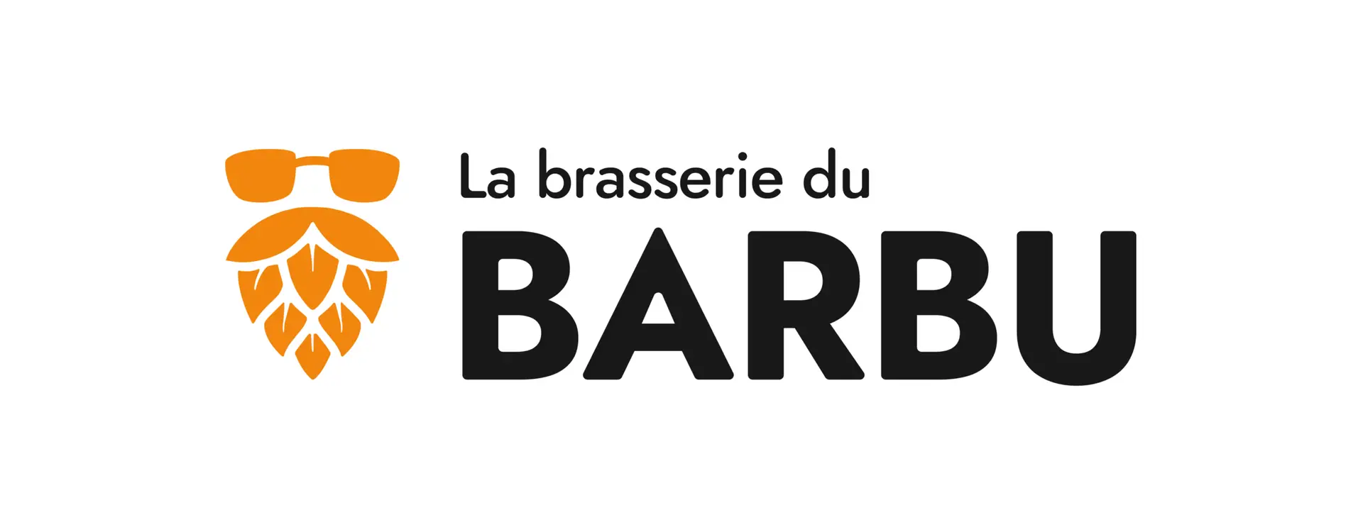
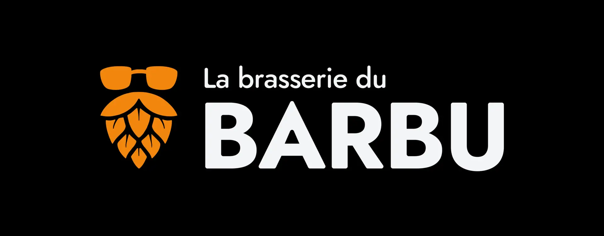
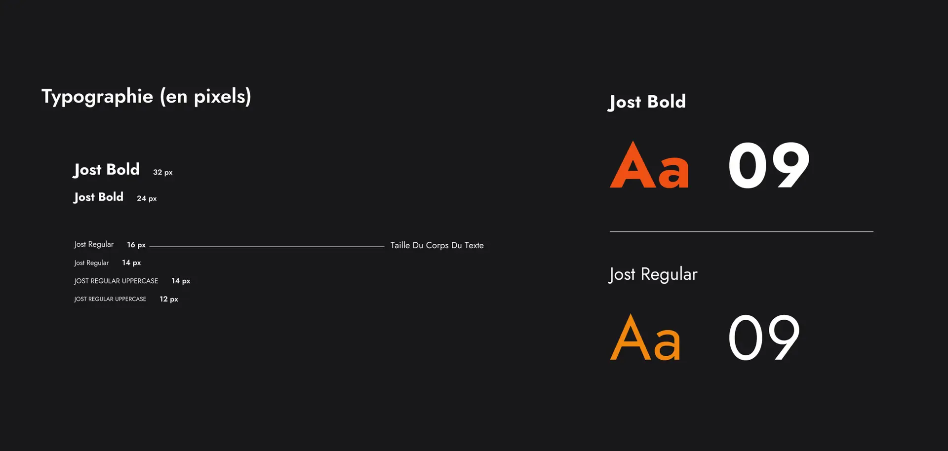
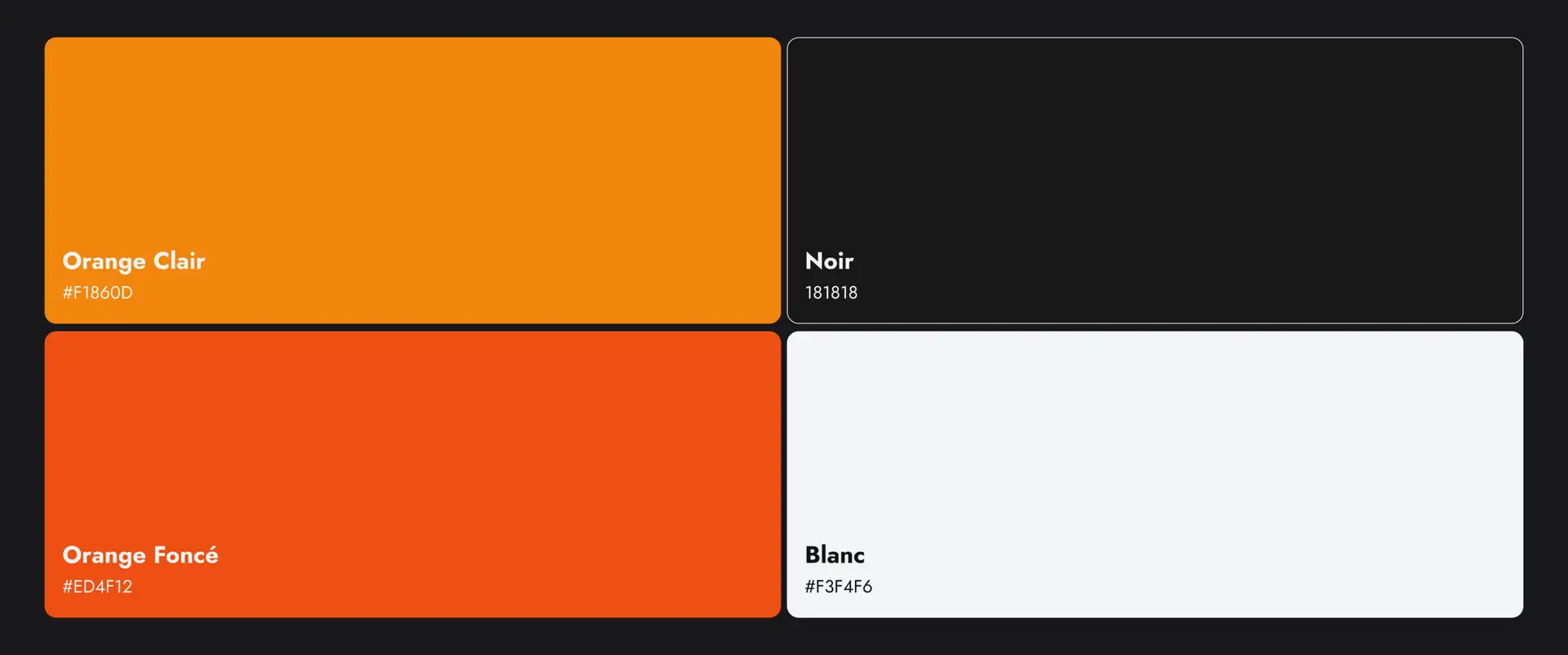
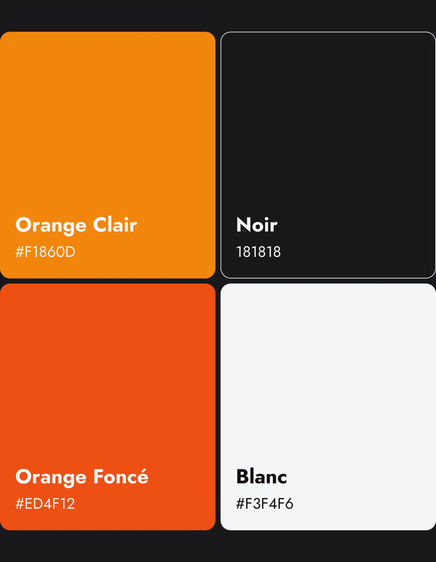
The choice of a orange accent, referencing beer, combined with a black background, creates contrast, character, and a premium dimension.
We wanted to preserve and highlight the brewery’s craft spirit, not through a rustic aesthetic, but through visuals and content that emphasize know-how, terroir, and the brand universe.
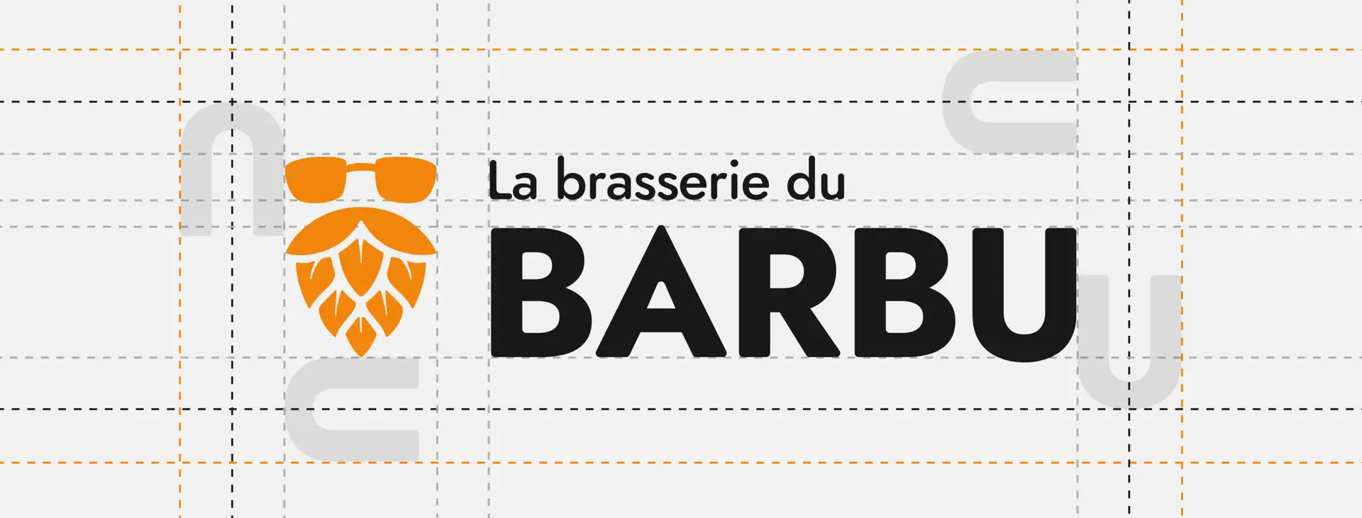
The logo was subtly refreshed to reinforce its personality and credibility, helping position the brewery in a more professional and assertive way.