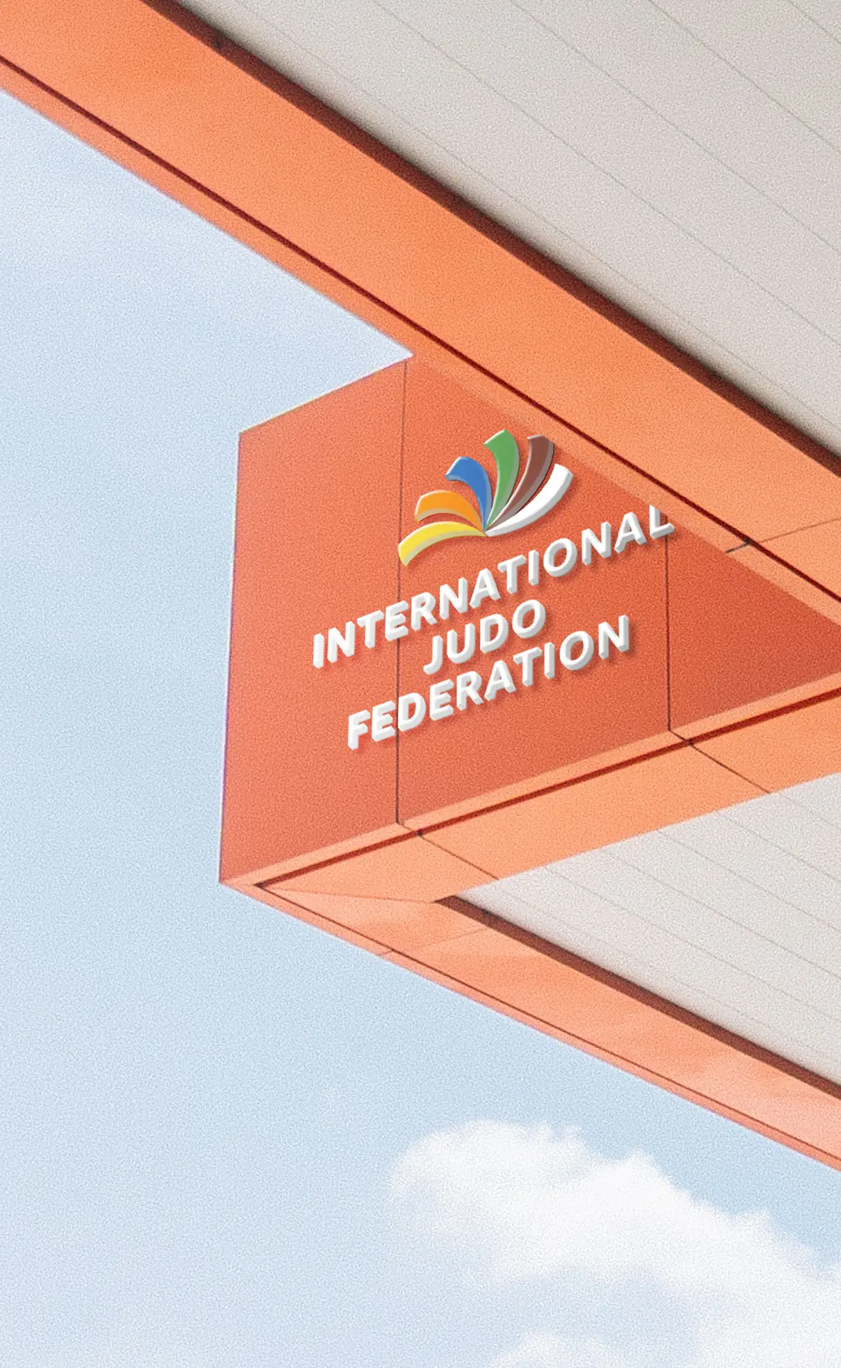
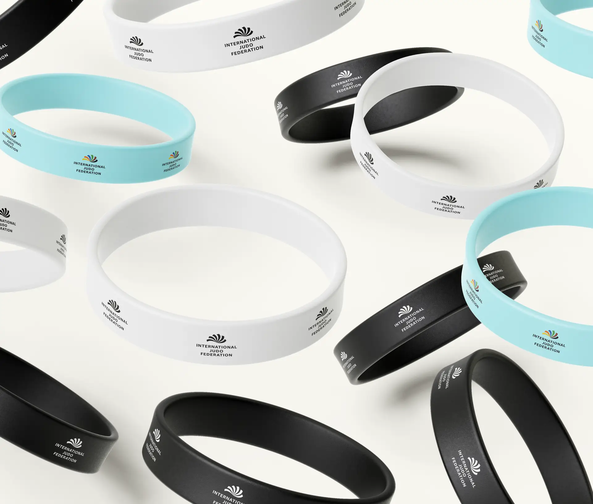
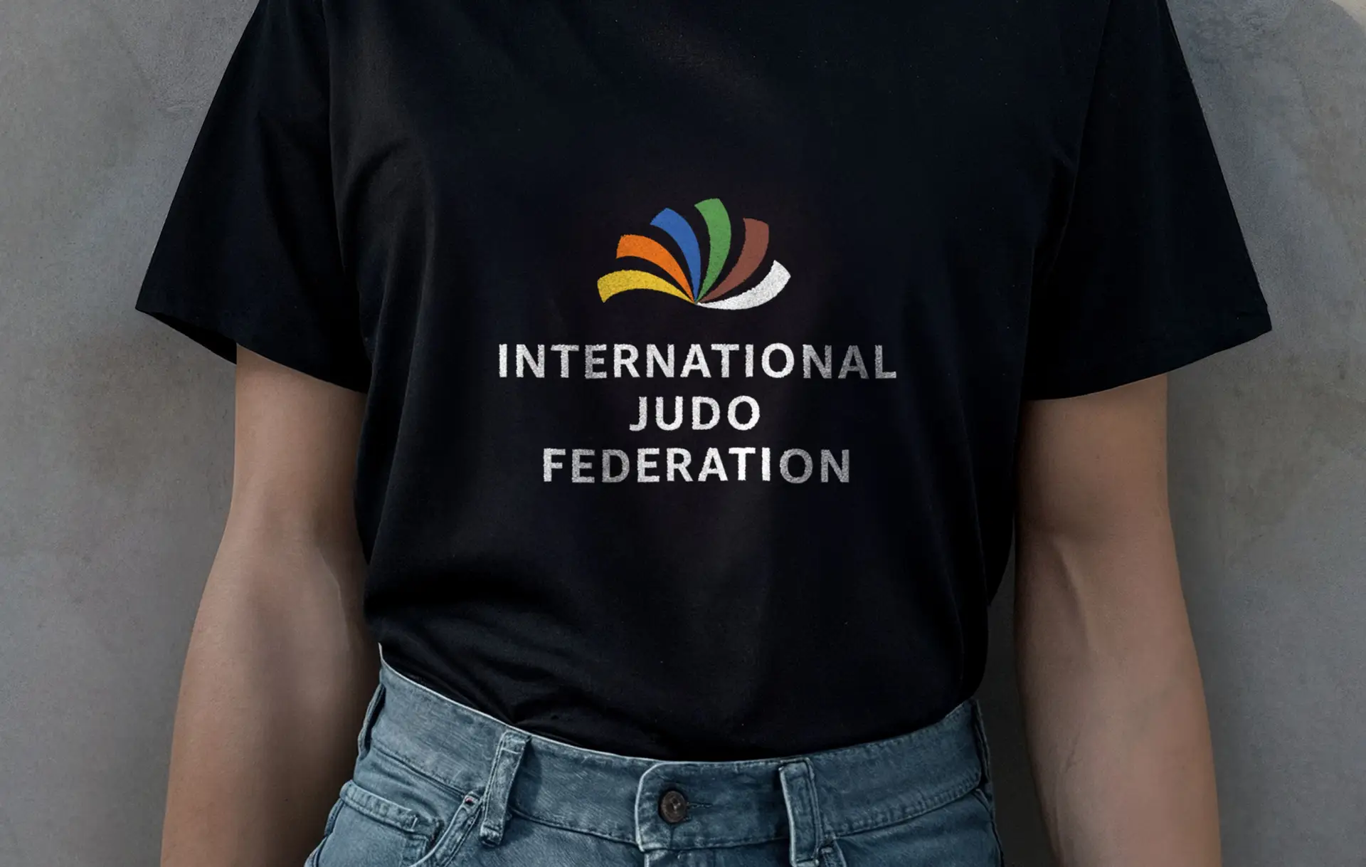
Proposing a new visual identity for the IJF
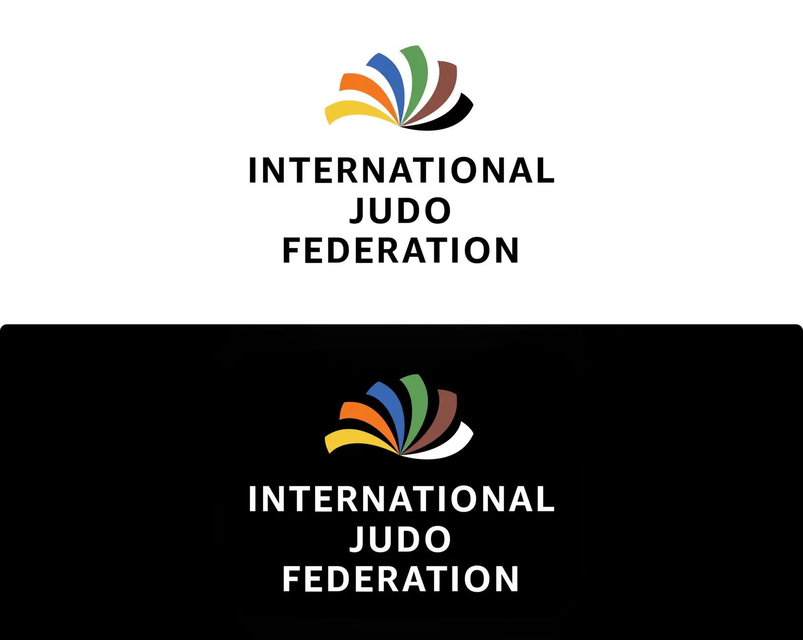
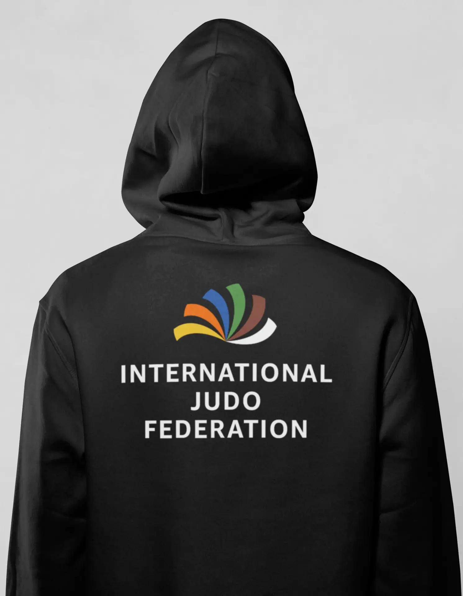
Creating a new visual identity for the International Judo Federation allowed me to modernize its image by representing its values.
My objective was to create something clear and easy to understand, conveying a sense of dynamism and movement associated with judo.
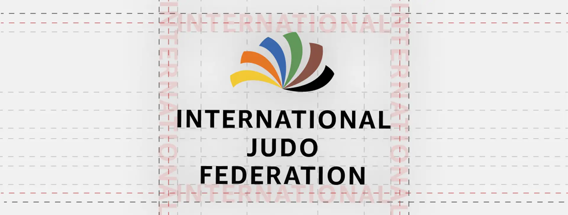
This logo represents the evolution through the ranks of judo, incorporating the belt colors in its classic version and the white belt in its negative version.
The words “International Judo Federation” are written below the belts in different colors, set in the Amazon Ember typeface, a font that brings seriousness and credibility to the federation.
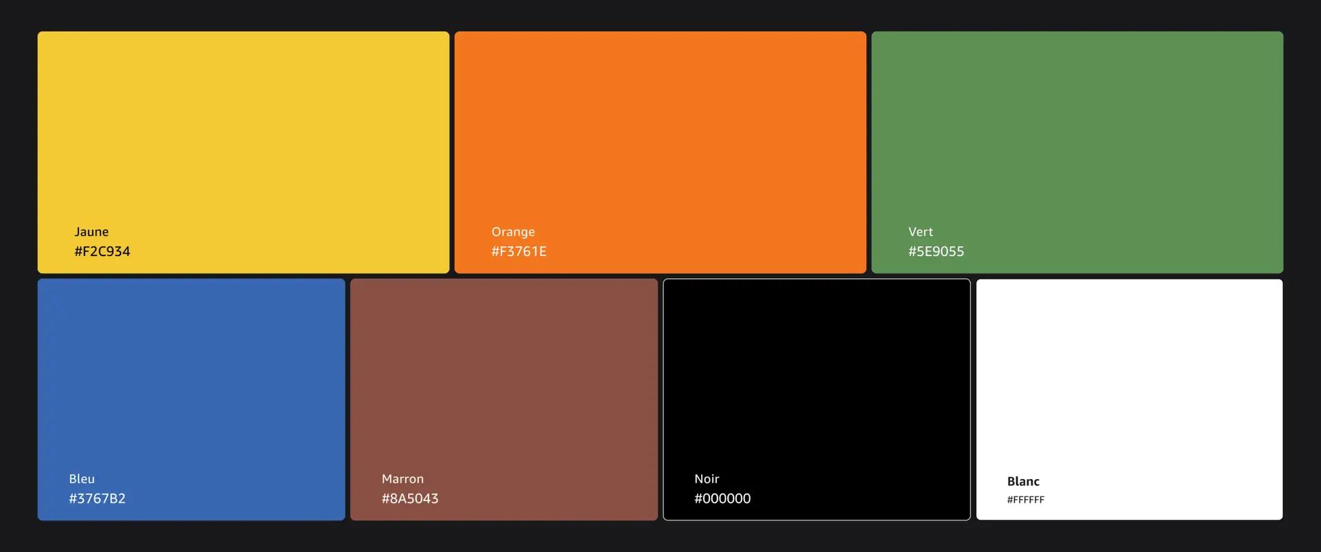
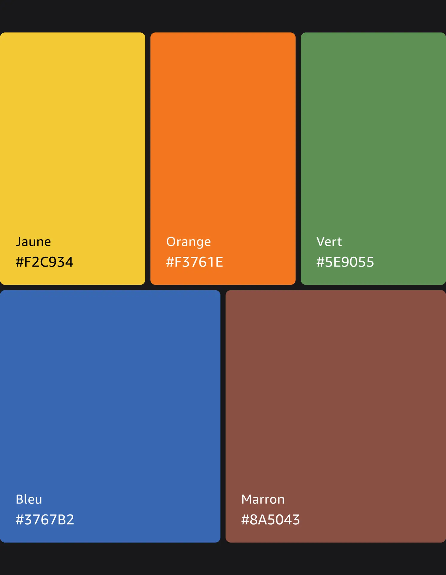
For the colors, I chose to use the main judo belt ranks: white, yellow, orange, green, blue, brown, and black. Arranged in the order in which they are earned.